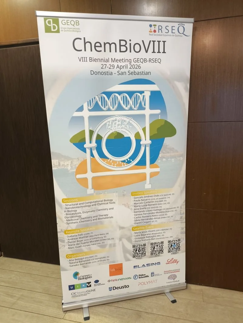
ChemBioVIII – Reunión Bienal GEQB-RSEQ
About it
The Challenge
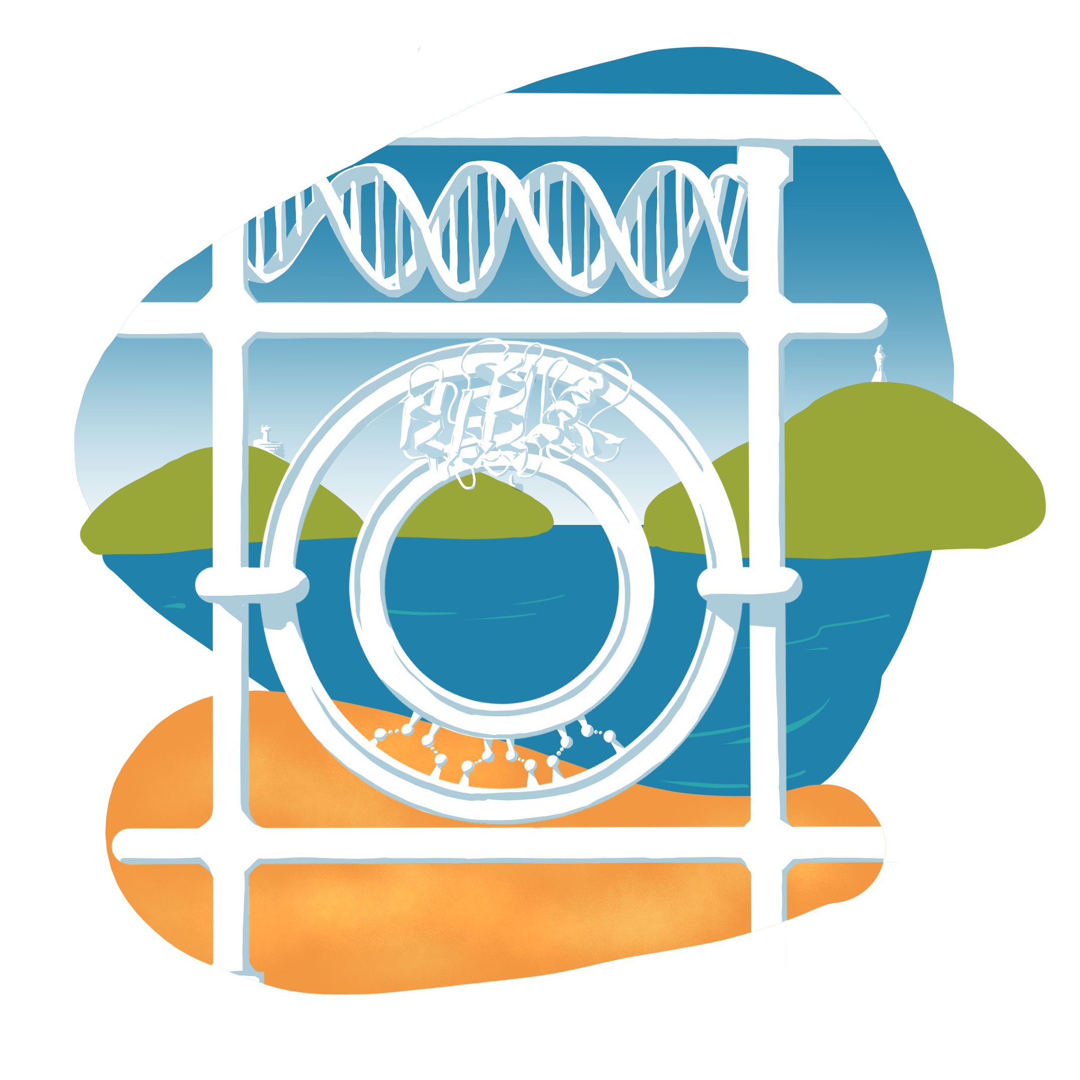
The logo for ChemBioVIII had to do two things at once: anchor the congress in Donostia–San Sebastián with instantly recognisable local symbolism, and communicate the scientific scope of the meeting: biochemistry and biotechnology. On top of that, it needed to work cleanly across digital media, print, and merchandising.
The Process
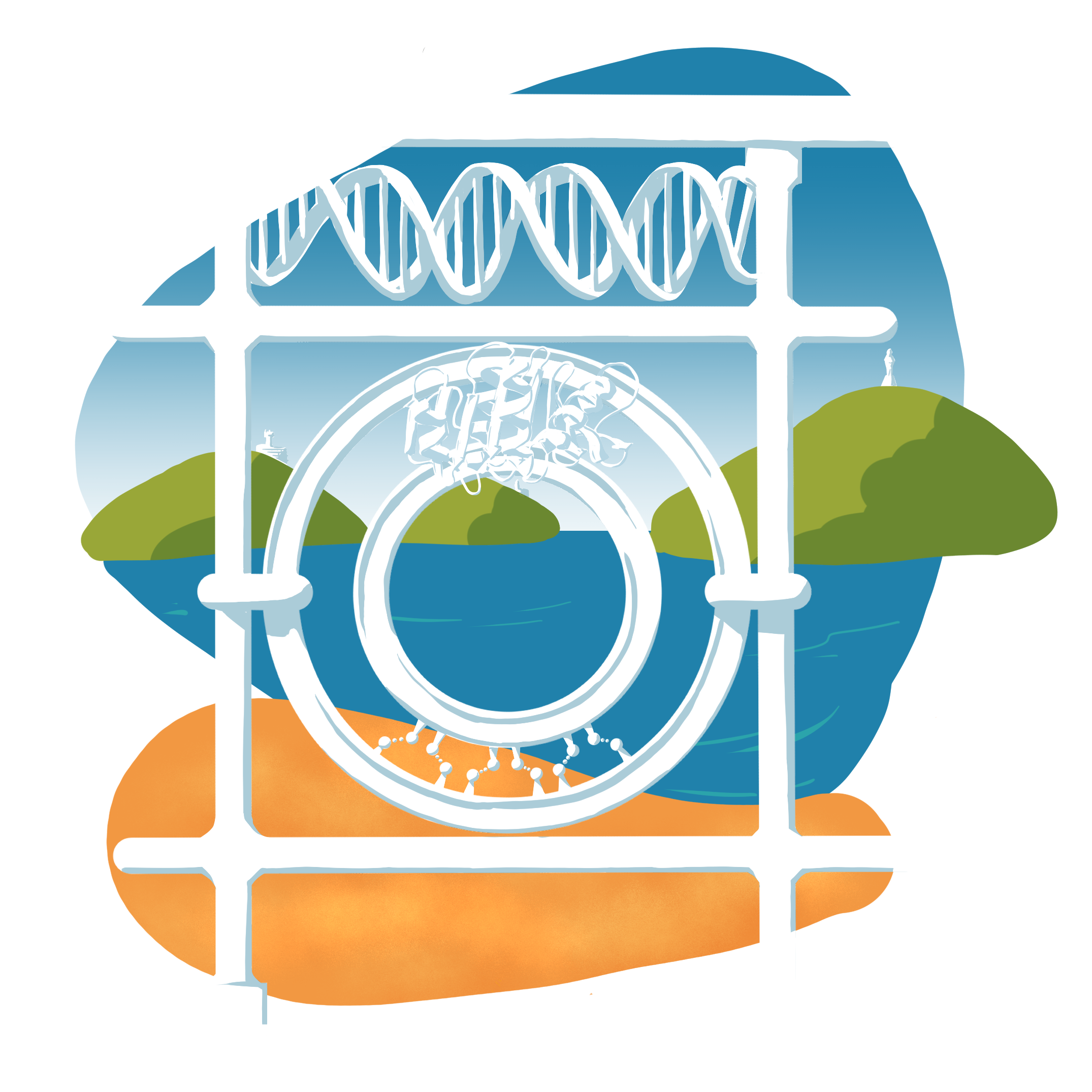
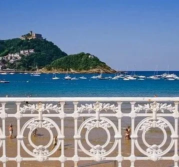
The design centres on a stylised reinterpretation of the La Concha beach handrail, one of the most recognisable symbols of the city. In this version, the original decorative motifs are replaced with molecular representations relevant to the congress: DNA, three-dimensional protein structures, and hydrogen bonds essential for protein stability and function. The handrail element was designed as a transparent figure, keeping the background colour visible through it, a practical decision that gives the logo visual flexibility and allows it to integrate consistently across different formats and surfaces.
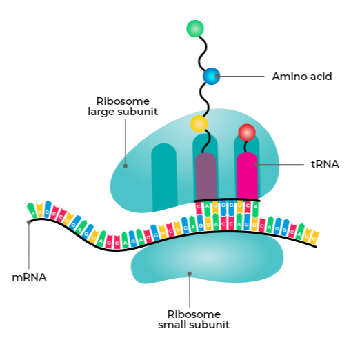
Behind the handrail, the background composition represents the landscape of La Concha Bay through the form of a ribosome, tying the setting directly to the biological focus of the event. The small ribosomal subunit, in golden tones, stands in for the sandy beach, while the larger subunit, rendered in blue, reflects the sea and sky. The ribosomal A, P, and E sites are highlighted in green and mapped onto three prominent landmarks visible from the bay: Monte Igueldo, Santa Clara Island, and Monte Urgull. The result is an identity where local and scientific meaning reinforce each other, and every element in the composition carries both a geographic and a molecular reading.