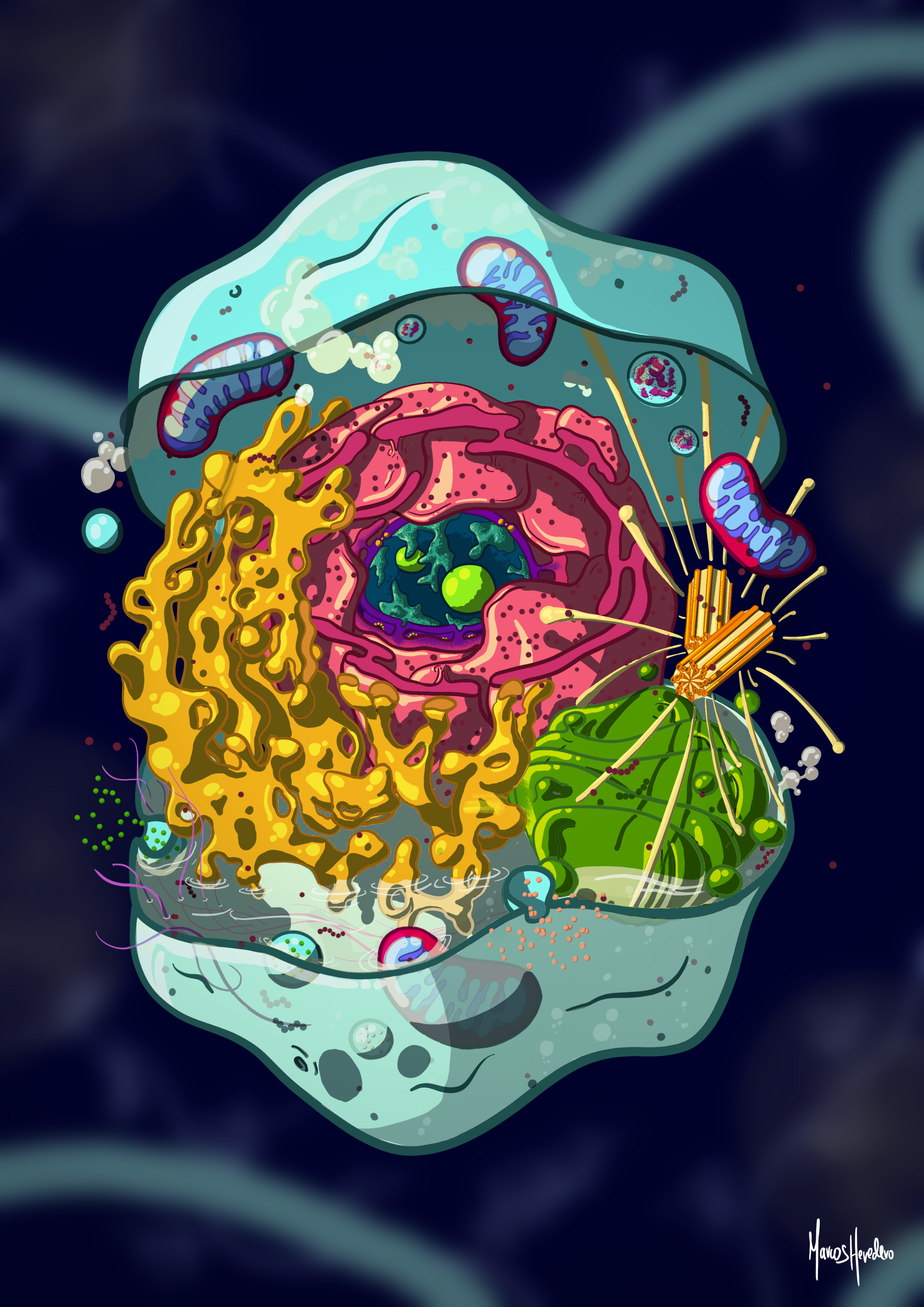
The Landscape That Makes Us Up
About it
This piece was prepared for the Ilustraciencia 13 Contest, but it's also a speculative project, a way to test whether science illustration can work in my own visual language. The goal was to reinterpret the classic animal eukaryotic cell diagram, the one we've all seen in textbooks, and rebuild it with a modern, colourful, somewhat graffiti-like approach so that both biology-literate viewers and complete newcomers could enjoy it equally.
The Challenge
The classic animal eukaryotic cell diagram is one of the most reproduced images in biology, and one of the most visually stale. The standard transversal cut flattens everything into a schematic that communicates structure but strips away any sense of volume, depth, or life. The challenge was to rebuild that diagram from scratch in a way that remained scientifically rigorous while feeling fresh, dimensional, and accessible to anyone, whether they studied cell biology or not.
The Process
The work started with documentation: reviewing dozens of animal cell diagrams across multiple sources to decide which structures to include, how to position them, and what characteristic shape each organelle should take. The priority was to build from a scientifically solid foundation before making any artistic choices.
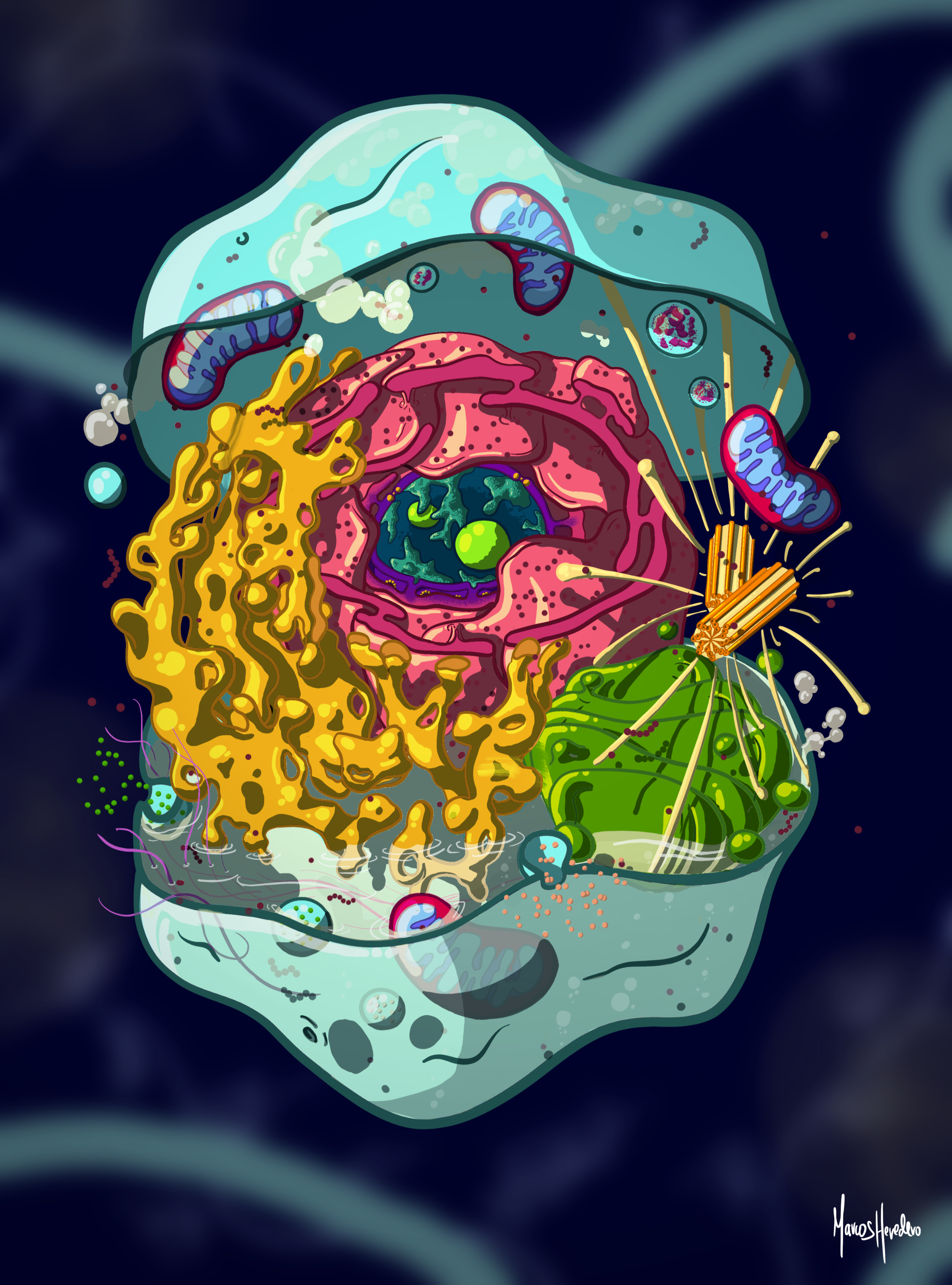
The biggest departure from tradition was the overall layout. Canonical diagrams tend to cut the cell along a transversal plane, which leaves organelles halved, submerged, and sliced. As a result, in the process we lose the sense that these structures have volume, position, and real depth inside the space. To break away from that, I imagined the cell as a music box that opens into two halves. Both remain visible within the composition, and inside them the viewer can see how each organelle sits within the interior, bounded by the extracellular membrane. It's not a cut that removes; it reveals. To reach the nucleus and expose its internal structures, I used a conical section. This progressively peels away layers, gaining depth toward the interior without losing the context of what surrounds the nucleus from the outside.
The technical execution was carried out through digital illustration on Procreate, following my personal style. I chose an isometric perspective to reinforce three-dimensionality, showing volume and depth across the whole composition. As usual, I worked with focal lighting: the lights and shadows aren't purely aesthetic; they convey the relief of each structure and place the viewer inside the space.
The colour palette followed the same logic: each cellular component carries its own high-contrast colour relative to its neighbours, making them easy to distinguish at a glance, while the palette as a whole coexists harmoniously. Seen from a distance, the image recalls a coral reef that invites exploration.